
Redesign of the Skyss App
For this project, I set out to redesign the Skyss app, drawing on my personal experiences using it. Over time, I identified several challenges related to both usability and visual design. This inspired me to create a new version that enhances the user experience while introducing a more modern and polished aesthetic.
To pinpoint key areas for improvement, I began by developing a mind map to outline the core functionalities and design elements I wanted to refine. To deepen my understanding, I created user personas to represent the app’s diverse target audience and conducted user-centered questionnaires to gather valuable insights into their needs and preferences.
To validate and refine my ideas, I incorporated usability testing, which provided essential feedback on the prototype. The redesign process culminated in the creation of an interactive prototype in Figma, enabling me to bring the concept to life with a focus on a seamless, user-friendly, and intuitive experience.

Low-Fi
Key Issues with the Skyss App
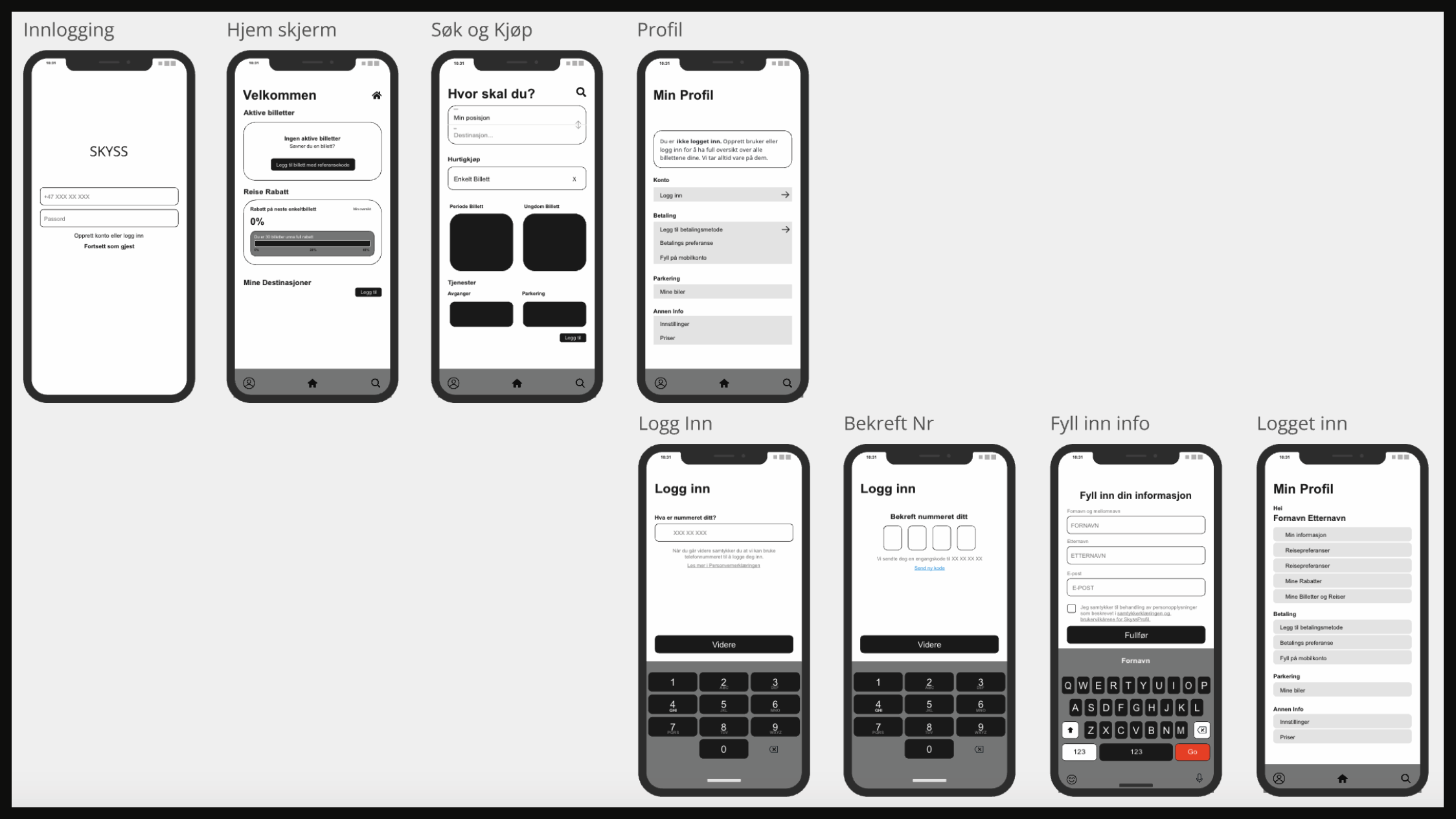
One of the primary challenges I faced with the Skyss app was its navigation. Additionally, Skyss relied on three separate apps to manage functions that could easily be consolidated into one. My goal was to streamline these functionalities into a single app, providing users with a more convenient and faster solution. This approach would also benefit users who may not have the space or desire to manage three different apps.
To address this, I combined the features of all three apps into one, creating three distinct sections within a single app. This allows users to navigate seamlessly between functionalities without switching platforms. My low-fidelity sketches outline the specific features assigned to each section, along with their placement and overall layout, ensuring a user-friendly and efficient design.

Mid-Fi
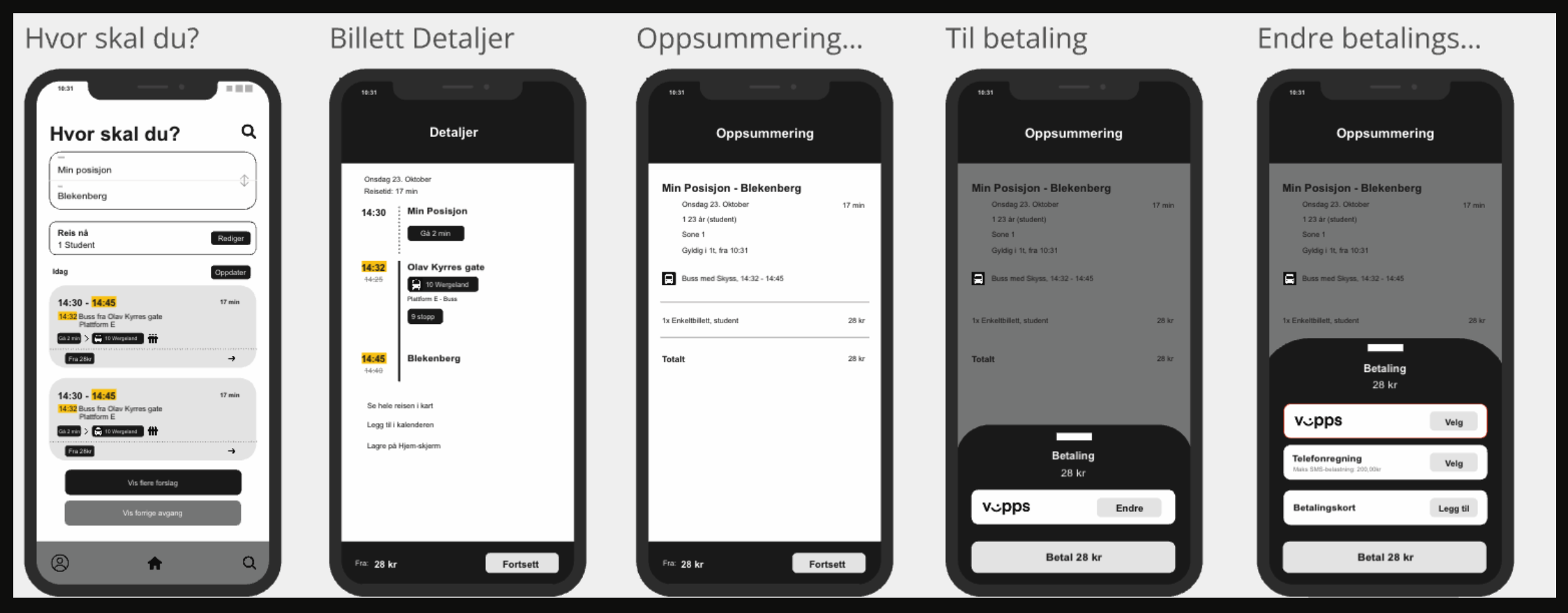
For the mid-fidelity sketches, I utilized Miro, which allowed me to map out each screen step by step. This process helped me determine what features should be included or excluded, as well as explore the overall visual structure, such as shapes and layout considerations.
Color schemes and detailed aesthetics were only incorporated during the high-fidelity prototyping stage, ensuring that the design priorities and functionality were firmly established before refining the visual elements.

Hi-Fi
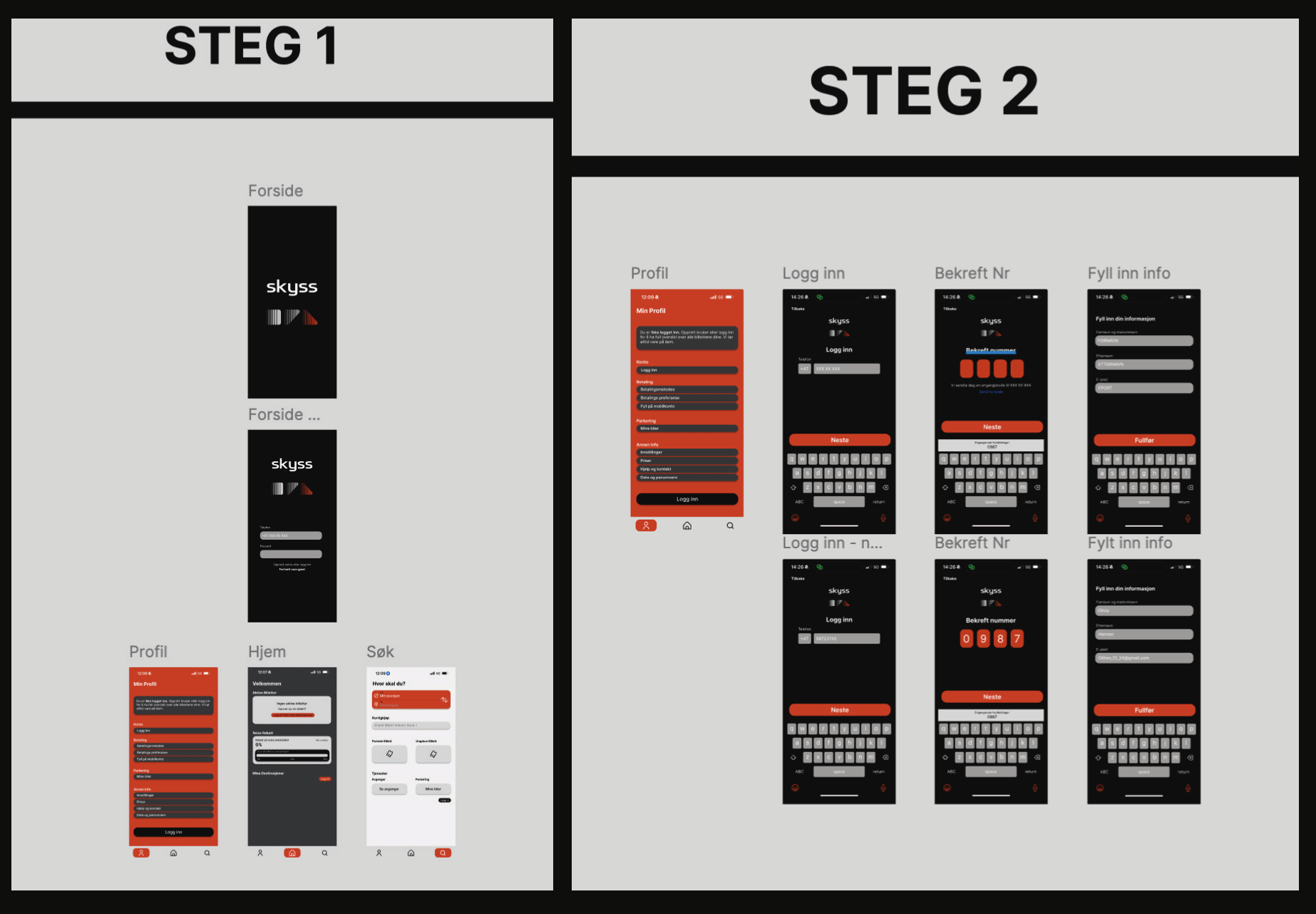
As mentioned earlier, the use of color was introduced during the high-fidelity stage of the design process. I chose to retain the Skyss brand colors as they are a significant part of the company’s identity, reflected in the public transportation system across Bergen. These colors are also present at all bus stops, making it the most natural choice to integrate them into the app redesign.
In addition, I selected a typeface that closely aligns with their previous typography while ensuring it remains highly legible for users across all demographics. To further enhance the user experience, I included a custom animation for the payment process, which I created in Figma. You can view this animation in the video at the top of the page.
To streamline my design process, I established a highly structured layout in Figma. This organization allowed me to navigate efficiently between different sections and elements of the project as I worked on the redesign. This approach not only saved time but also ensured that every part of the design remained consistent and cohesive throughout the process.


